Introduction
Coded UI a lightweight web framework consists of huge variety of CSS modules and animation plugins
Get started
Coded UI (currently v1.0.0 beta) has few easy ways to quickly get started each one appealing to a different and use case. Read through to see what suits your particular needs.
Looking to quickly add Coded UI to your project?
Head to the download page first
CSS
Copy-paste the stylesheet <link> into your <head>before all other stylesheets to load our CSS.
JS
Many of our components require the use of JavaScript to function. Specifically, they require jQuery, , and our own JavaScript plugins. Place the following <script> near the end of your pages, right before the closing </body> tag, to enable them. jQuery must come first and then our JavaScript plugins
Add the viewport meta element
The viewport meta element lets you control the width and scale of the viewport on mobile browsers. Since you're building a responsive website, you want the width to be equal to the device's native width. Add this into your page's <head>
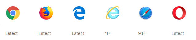
Browser support
The following table lists the versions that Coded UI is tested on. "Latest" means that it works just fine on all recent versions of that browser. With many browser moving towards a rolling release strategy, pinning down browser support to a specific version has become a little tricky in recent years. Long story short: Coded UI will work on pretty much any modern browser
Community
Stay up to date on the development of Coded UI and reach out to the community with these helpful resources
- Follow @Coded_Ui on twitter
- Follow @Coded_UI on instagram
Starter template
Be sure to have your pages set up with the latest design and development standards. That means using an HTML5 doctype and including a viewport meta tag for proper responsive behaviors. Put it all together and your pages should look like this:
<!doctype html>
<html lang="en">
  <head>
    <!-- Required meta tags -->
    <meta charset="utf-8">
    <meta name="viewport" content="width=device-width, initial-scale=1, shrink-to-fit=no">

    <!—Coded UI CSS stylesheets-->
    <link rel="stylesheet"  type=”text/css” href=””>
    <!—queries stylesheet-->
    <link rel=”stylesheet” type=”text/css” href=””

    <title>Hello, world!</title>
  </head>
  <body>
    <h1>Hello, world!</h1>
 <!-- Optional JavaScript -->
 <!-- jQuery first, then Coded UI JS -->
    <script src="” ></script>
  </body>
</html>
Queries starter template
Using media queries are a popular technique for delivering a tailored style sheet (responsive web design) to desktops, laptops, tablets, and mobile phones.
/* Big tablets to 1200px (width smaller than the 1140px row) */
@media only screen and (max-width: 1200px) {

}

/* Small tablests to big tablets: from 768px to 1023px */
@media only screen and (max-width: 1023px) {

}

/* Small phones to small tablets: from 481px to 767px */
@media only screen and (max-width: 767px) {

}

/* Small phones: from 0 to 480px */
@media only screen and (max-width: 480px) {

}
Responsive Grid System
Coded UI’s grid system is responsive. The columns will re-arrange automatically depending on the screen size:
span-1-of-2
span-1-of-2
span-1-of-3
span-1-of-3
span-1-of-3
span-1-of-4
span-1-of-4
span-1-of-4
span-1-of-4
span-1-of-5
span-1-of-5
span-1-of-5
span-1-of-5
span-1-of-5
span-1-of-6
span-1-of-6
span-1-of-6
span-1-of-6
span-1-of-6
span-1-of-6
span-1-of-7
span-1-of-7
span-1-of-7
span-1-of-7
span-1-of-7
span-1-of-7
span-1-of-7
span-1-of-8
span-1-of-8
span-1-of-8
span-1-of-8
span-1-of-8
span-1-of-8
span-1-of-8
span-1-of-8
<link rel="stylesheet" type="text/css" href="coded.css">
Navigation Menu
Minimialist navigation menu which will be customized according to your needs.
<link rel="stylesheet" type="text/css" href="coded-nav.css">
Button
Buttons are an ordinary, every-day element of interaction design. Despite this, because buttons are a vital element in creating a smooth conversational flow in web.
In this framework some of best User Experience (UX) practices are used in the make the experience of the user convenient and easy to use.
<link rel="stylesheet" type="text/css" href="coded.css">
Toggle Button
Toggle buttons are alternative to the radio buttons, to make the web form look different you can go with toggle buttons instead of radio button
<link rel="stylesheet" type="text/css" href="coded-toggle.css">
Checkboxes
Checkboxes are used when there is a list of options and the user may select any number of choices, including zero, one, or several. In other words, each checkbox is independent of all other checkboxes in the list, and checking one box doesn’t uncheck the others.
<link rel="stylesheet" type="text/css" href="coded-checkbox.css">
Radio Button
Radio buttons are an essential element of forms. They are used when there is a list of two or more options that are mutually exclusive and the user must select exactly one choice. In other words, clicking a non-selected radio button will deselect whatever other button was previously selected in the list.
<link rel="stylesheet" type="text/css" href="coded-radiobtn.css">
Contact Form
Web forms play a pretty important role on the web. Be it to subscribe to a newsletter, sign up for an account, or make an online purchase – there are a lot of different kind of forms out there that build the foundation for many online interactions.
Contact forms are among the most convenient ways to get in touch with the people behind a website – if designed with thought.
<link rel="stylesheet" type="text/css" href="coded-contactform.css">